


Concept · 1 October 2026 · Norbert Szymkiewicz

I signed up for Boski. Here's the onboarding I'd ship.

I went through your onboarding on my iPhone on 30.09, recorded it and rebuilt the flow in code. Same steps and the same swipe cards, with three fixes: trust, answers that come back, and value before the paywall.

3:13

minutes from sign-in to paywall

~25

taps and swipes

0

moments of value before you pay

From my run through the onboarding on 30 September 2026.

What changes

Three fixes

Say where facts come from

Cards about you arrive with no source, and the first one is your age. A short lookup names the sources first, every card carries its source, age is gone.

Make answers matter

Four sliders whose answers never come back. Now objects react as you slide, and your vibe returns on the profile.

Value before the paywall

Today the paywall comes right after the goal. Now Boski hands you a first step with the work already done, then the paywall continues that card.

Screen by screen

Today → concept

01

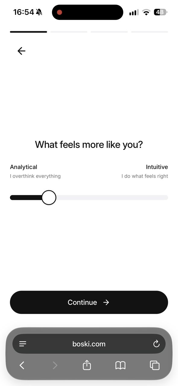
What feels more like you?

Four identical slider screens. The answers never come back anywhere, so they feel meaningless.

  • One screen, a stack of 4 cards.
  • Objects at both ends react as you slide; 5 snap points with haptics and a tick.
  • The middle is an answer too: “Analytical & Intuitive”.
  • Your vibe flies into the progress bar and comes back on the profile.
Try this screen →
Today
Boski today: What feels more like you?
Concept

02

Looking you up…

Today there is no such screen: you land straight on cards about yourself, and the first reaction is “how do you know this?”.

  • A new 4-second screen that says where Boski looked: LinkedIn, portfolio, Instagram.
  • “Nothing is saved until you confirm it.”
  • Then the sources fold into the stack of cards you are about to check.
Try this screen →
Today
No such screen today. You land straight on cards about yourself.
Concept

03

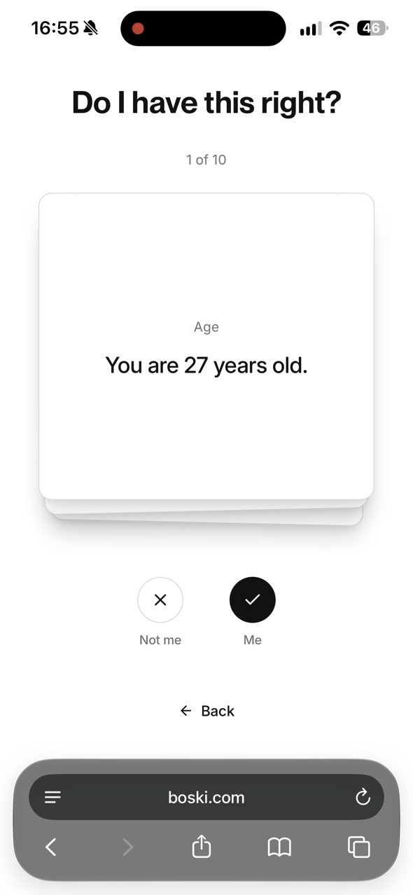
Do I have this right?

Text-only cards with no source, and the first one is your age: the most sensitive fact goes first.

  • No age. Neutral facts first, personal ones later.
  • Every card has a sticker, a category and where it came from (“from LinkedIn”).
  • Swipe stamps ME / NOT ME. Me: the sticker flies into your mini profile. Not me: it dissolves. Undo is always there.
Try this screen →
Today
Boski today: Do I have this right?
Concept

04

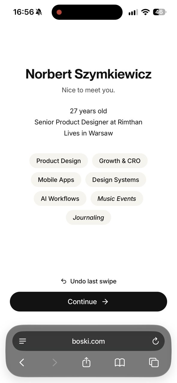
Nice to meet you

“Nice to meet you” is a list of text badges, and the slider answers are missing.

  • Your name assembles from particles.
  • Confirmed facts drop in as stickers with real physics: drag them, throw them.
  • Tap one to see its source or remove it. Your vibe comes back underneath.
  • “Where did this come from?” groups everything by source.
Try this screen →
Today
Boski today: Nice to meet you
Concept

05

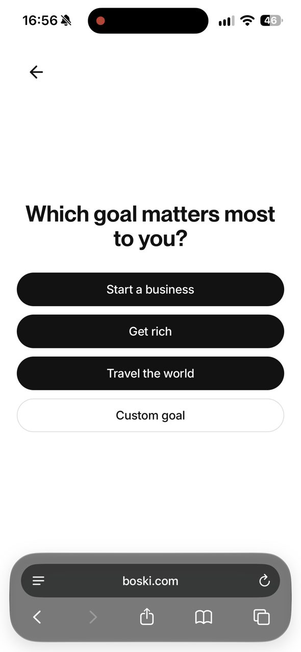
Which goal matters most?

Four black buttons, and different goals than the landing page promises (love, rich, famous).

  • Goals from the onboarding and the landing on one glass picker that bends what passes under it.
  • A suggestion backed by the facts you confirmed.
  • “This week with Boski” changes as you pick, with the things Boski already prepared underlined and tappable.
Try this screen →
Today
Boski today: Goal
Concept

06

Here's your first step.

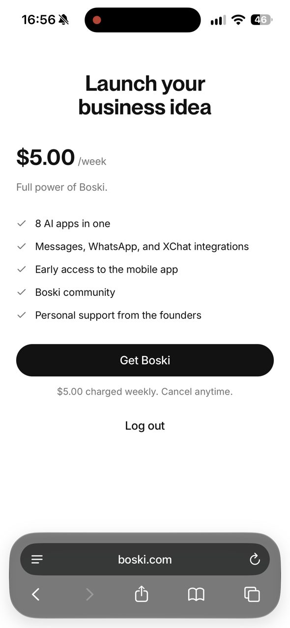
Right after picking a goal comes the paywall. You pay before Boski has done anything for you.

  • Your first next step in the style of your landing: “Land your first client. Send the pitch I drafted.”, with the pitch already written.
  • Why this step, with the source of the fact behind it.
  • Slide to commit, “I'll check in on Friday”, then a paywall that continues the same card: goal in the headline, 19,98 zł / week, plan “Regular” like in Stripe.
Try this screen →
Today
Boski today: First next step
Concept

For the devs, no design needed

Bugs and quick wins

Things you only notice going through it as a new user. They cost the most at the most fragile moment: verification and checkout.

  • 1

    Session lost on the way to Messages

    Switching apps to read the SMS code sent me back to the landing: Sign in with Apple and the phone number again. ~30 s at the most fragile moment.

  • 2

    SMS code autofilled into the phone field

    The “From Messages” suggestion showed up on the number field. autocomplete="tel" on the number, autocomplete="one-time-code" + inputmode="numeric" on the code.

  • 3

    “Log out” in the middle of onboarding

    Visible on every verification screen and on the paywall.

  • 4

    Currency and plan change at checkout

    $5.00 / week in the app, then “Subscribe to Regular, PLN 19.98 per week” in Stripe. “Regular” appears for the first time on the last screen.

  • 5

    Goals don't match the landing

    Landing: finding love, getting rich, becoming famous. Onboarding: start a business, get rich, travel, custom.

Not in this concept yet

What I'd do with the rest

In the prototype these screens show what Boski looks like today, with a short note.

Welcome

“Welcome to Boski. Log in or sign up.” The first screen that talks says nothing about what Boski does.

  • One line of promise plus something alive: goal objects floating around the logo.

Name, @username, city

Full name, username and city on one form. The name is already known from Sign in with Apple.

  • “Is this you, Norbert?” Confirm with one tap, edit if needed.
  • One action per screen, with the progress bar from the start.

Verify

Leaving for Messages to get the code dropped me back to the landing page: Sign in with Apple and the number again (~30 s). The code autofill also went into the phone field.

  • Number and code on one screen, the code field slides in and verifies itself after 6 digits.
  • autocomplete=“tel” on the number, “one-time-code” on the code, session kept when you switch apps.
  • No “Log out” in the middle of onboarding.

Beyond the onboarding

Where I'd look next

This concept is a first pass at one flow. Things I noticed around it that are worth working on:
iMessage, where Boski lives

There is no UI of your own there, so the design is the copy, the rhythm of messages, rich link previews (for example an image with your weekly progress) and the contact card people save.

Paywall and checkout as one flow

The same promise, plan name and currency from the first-step card all the way to Stripe, so nothing changes at the moment of paying.

One object library

One prompt and one style for objects and stickers across the app, the website and App Store screenshots. Every new fact or goal gets its object.

The iOS app

These components are written to port to SwiftUI, where Liquid Glass, haptics and numeric text transitions are native.

If we keep going

What I'd do next

Week 1
The quick wins below, the lookup screen and a source on every card. Biggest trust gain for the least work.
Weeks 2–3
First step before the paywall, goals that match the landing, one action per profile screen (@handle with live availability, city with a flag).
Collect what you don't today
Preferred channel and time of day, daily rhythm, “what's blocking you right now?” (raw material for the first step), import from ChatGPT or Claude.
Measure
Completion per screen, % “Not me” per fact (data quality), time to paywall, paywall conversion before and after the first step.

Under the hood

How it's built

  • Next.js 16, React 19 and motion: your web stack. Written to port 1:1 to SwiftUI (springs → .smooth / .bouncy, the number drum → .contentTransition(.numericText()), the stepper → matchedGeometryEffect, the goal lens → .glassEffect()).
  • Built for 60 fps on iPhone: a light 2D canvas for the particle name instead of WebGL, blur instead of SVG displacement on big cards, refraction only inside the small lens.
  • Sound is synthesized (no audio files) and stays in one key, E major: the three checkmarks in the lookup make a chord, and committing to the first step resolves it.
  • A deterministic demo: no backend, no AI. The facts come from my own run through your onboarding on 30.09, minus my age. About 90 design decisions are written down, each with a reason.

Try it in your hand.

Motion, haptics and sound only make sense on a phone. On iPhone: Share → Add to Home Screen opens it full screen.

Open the prototype